
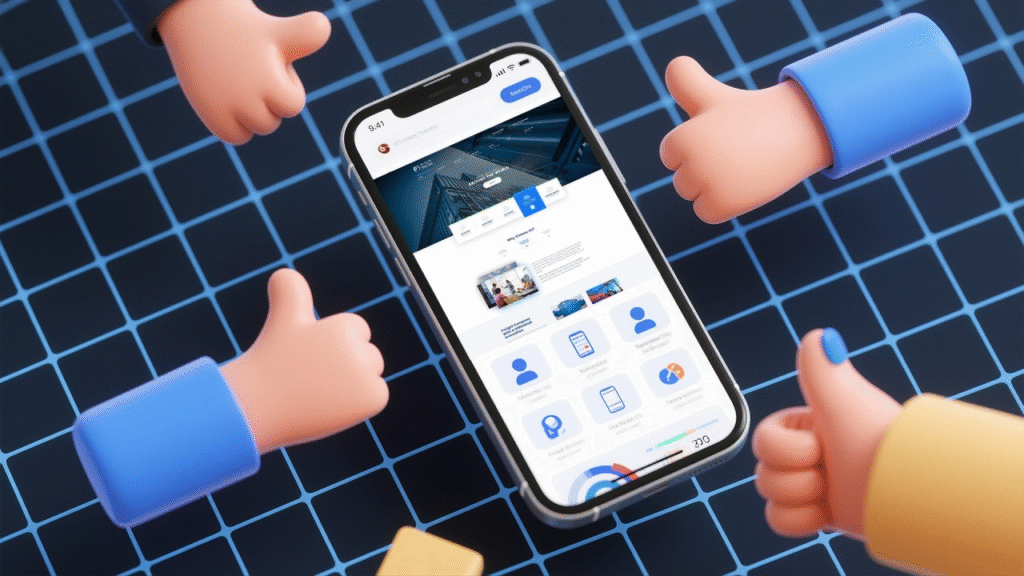
Why Mobile-First Design is No Longer Optional
In today’s digital landscape, mobile devices aren’t just a secondary option—they’re the primary way people access the internet. From social media browsing to online shopping and banking, mobile has become the go-to platform for everyday tasks. For businesses, this means one thing: a mobile-first design approach is no longer optional—it’s essential.
The Rise of Mobile Internet Usage
According to recent statistics, over 70% of global web traffic now comes from mobile devices. In Nigeria, this figure is even higher, with smartphones becoming the main access point to the internet due to affordability and convenience. If your website or app isn’t optimized for mobile, you’re potentially losing more than half your audience.
What is Mobile-First Design?
Mobile-first design means designing for smaller screens before scaling up to desktops. Instead of shrinking a desktop layout for mobile (which often leads to poor usability), you start by creating a seamless mobile experience and then enhance it for larger screens.
Why It’s Critical for Businesses
- Better User Experience – Mobile-first design ensures your content is easy to read, navigate, and interact with on smartphones. This reduces bounce rates and keeps users engaged.
- Higher Search Rankings – Google uses mobile-first indexing, meaning it prioritizes the mobile version of your site when ranking search results.
- Faster Load Times – Mobile-first websites are built to be lightweight and optimized, improving performance and keeping impatient users from leaving.
- Increased Conversions – A mobile-friendly design makes it easier for customers to complete actions like making purchases, signing up for newsletters, or filling out forms.
Mobile-First Beyond Websites
It’s not just websites—mobile-first thinking should apply to apps, email campaigns, and digital ads. Your marketing content should be easy to view and interact with on any device.
How to Implement Mobile-First Design
- Start with the smallest screen and build upwards.
- Prioritize essential content and features for mobile users.
- Use responsive frameworks like Bootstrap or Tailwind CSS.
- Test across multiple devices to ensure consistency.
Mobile-first design is no longer a trend—it’s the standard. In a market where mobile usage dominates, businesses that fail to adopt this approach risk losing visibility, engagement, and revenue. Whether you’re building a new website or redesigning an existing one, start with mobile in mind, and you’ll stay ahead of the competition.